the Floral Medley Collection: Modern Fabrics Inspired by Nature

Hi everyone!

I wanted to take a moment to share a quick life update since I’ve been a bit quiet here lately. Back in September, my family and I embarked on an international move to Spain. While this isn’t our first overseas adventure, it’s definitely been the most challenging. Adjusting to life in Spain has come with its unique hurdles—like learning to navigate the narrow roads of Europe after six years of not driving and being spoiled by spacious American streets and parking lots!

On top of that, I’ve been focused on learning Spanish, which has taken up much of my creative energy. Mastering a new language is so hard!—it’s both incredibly rewarding and time-consuming. Unlike Singapore or the Netherlands, where most people speak English fluently, here in Spain, I’ve had to dive headfirst into learning the local language.

Simple everyday tasks—like making a doctor’s appointment, asking for help in a store, or ordering food at a restaurant—have felt like monumental challenges. Sometimes, I’ve even avoided situations entirely because I felt too overwhelmed to face the language barrier. Instead of spending hours creating, I’ve been dedicating several hours a day to studying Spanish. Progress has been slow, but I’m starting to see improvement, and that keeps me motivated.

My son often asks, “If you could choose a superpower, what would it be?” My answer is always the same: to be a polyglot. He insists that speaking multiple languages isn’t really a superpower, but I disagree! To me, being able to communicate seamlessly with people across the world would feel like having a real superpower.

Returning to Creativity with the Floral Medley Collection

This long-winded explanation is all to say why I’ve been quieter than usual creatively. However busy or distracted I am, I always find a moment or two to doodle and sketch. I’ve returned to my sketchbook and even managed to set up a little basement studio in our new home. Recently, I sifted through my scattered sketches and half-finished designs, organizing them into themes. From those pieces came my newest project: the Floral Medley Collection.

the FLORAL MEDLEY COLLECTION

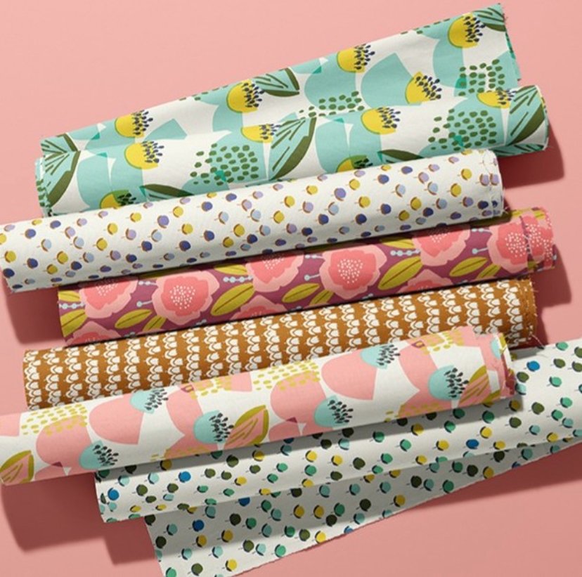
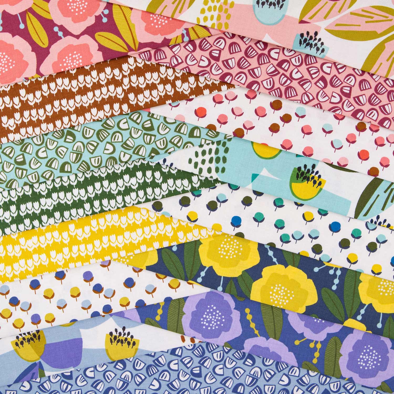
This collection is inspired by the beauty of nature—delicate wildflowers, rustic botanicals, and playful abstract forms. It blends natural elements with a fresh, modern aesthetic.

Each pattern tells its own little story:

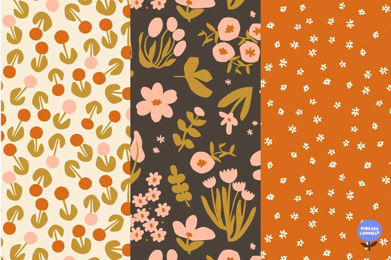
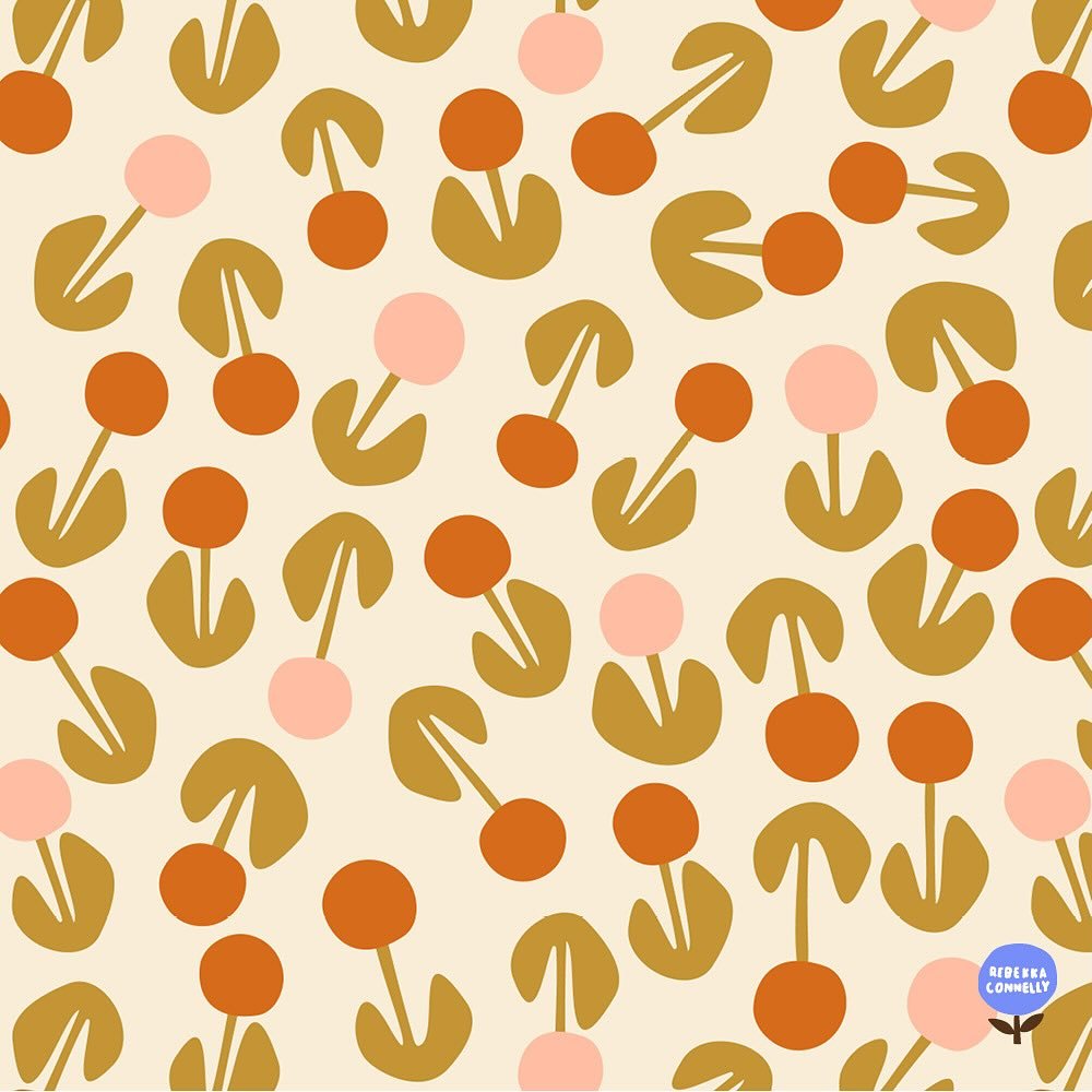
The bold, retro-inspired florals, with vibrant shapes that make a playful statement.

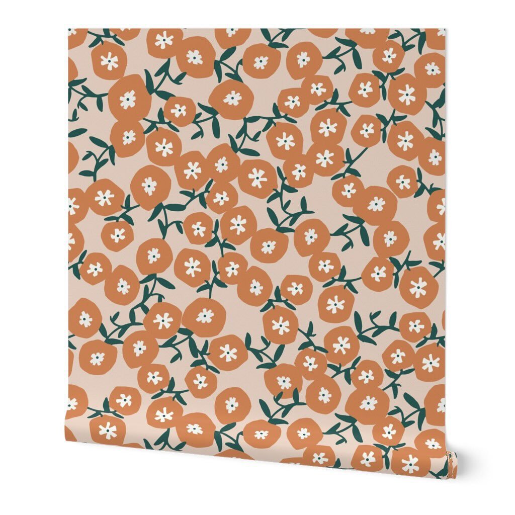
A seamless pattern featuring stylized floral motifs with circular blossoms in orange and pale pink, paired with olive-green leaves, set against a cream-colored background

The whimsical charm of dainty daisies, perfect for happy and cheerful designs.

A simple pattern of small white floral shapes scattered across a warm orange background, creating a minimal and playful design

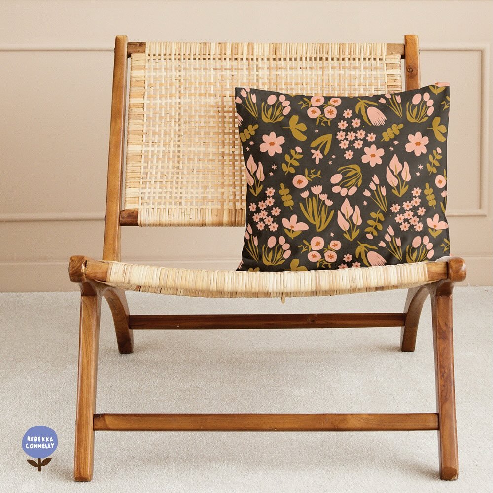
The dark, rustic wildflower motifs, bringing a touch of depth and sophistication.

Exploring a New Color Palette

The color palette for this collection marks a new direction for me. My comfort zone has always been designing on a cream background, and I started there initially. But while I loved the earthy tones of the rusty reds and sage greens, the designs still felt like they were missing something.

After experimenting with color, I landed on a deep brown paired with soft pink accents. This combination adds a richness and warmth to the designs that feels fresh and unique. Here is a little before and after:

Design Versatility

One thing I aimed for with the Floral Medley Collection was versatility. The patterns are designed to complement each other while also standing strong on their own.

For example:

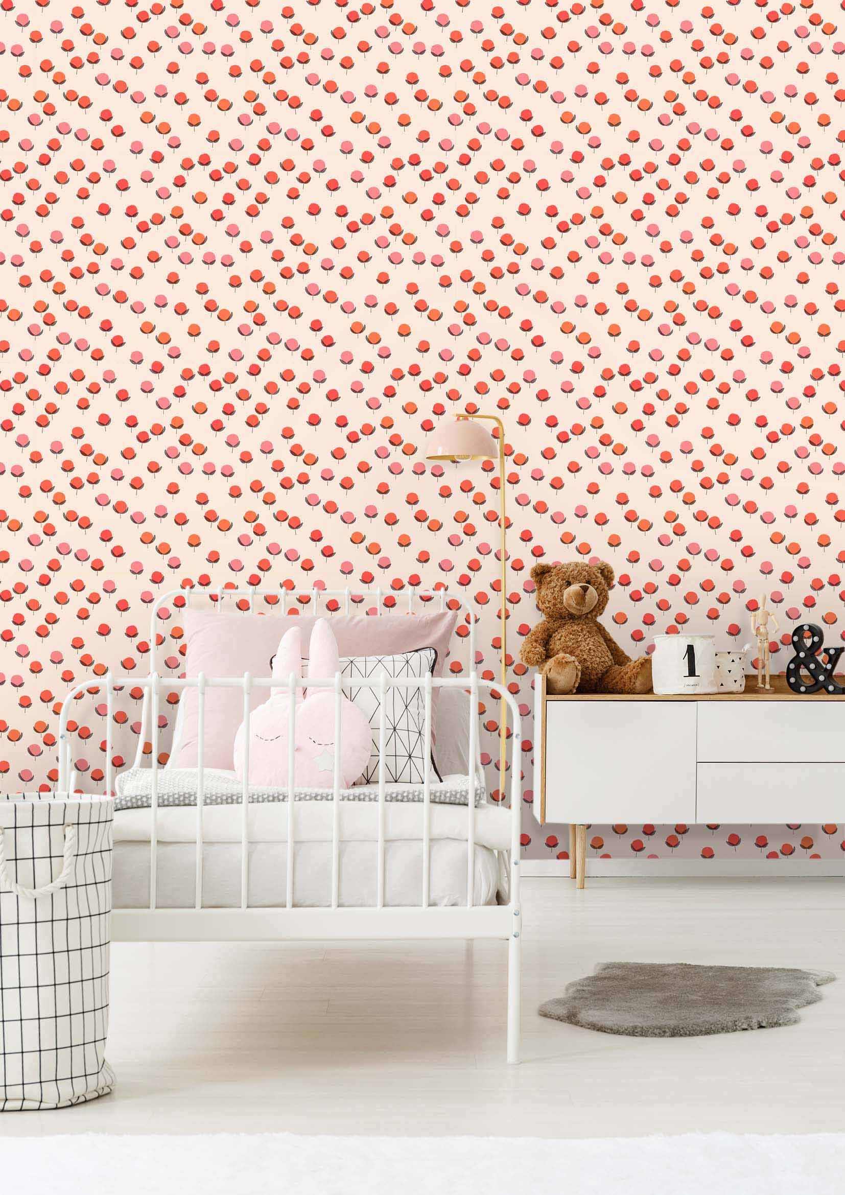
This soft peach blossom print offers a minimal and feminine option, perfect for light, airy projects.

An abstract leaf or willow-inspired pattern adds a bold, modern touch while maintaining a neutral vibe.

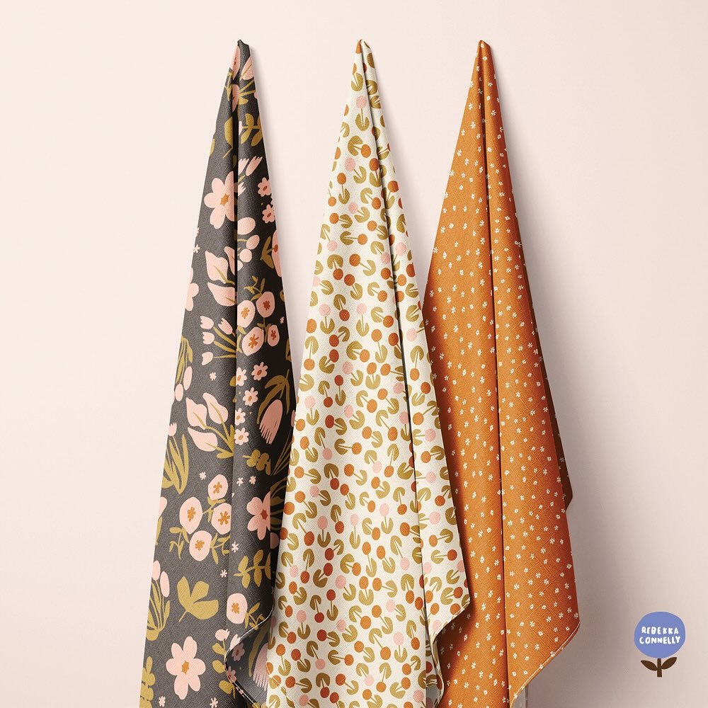
While the designs work beautifully as standalone pieces, they also shine when paired together. It’s satisfying to experiment with different combinations like these three designs.

What Will You Create?

I’m so curious to see how you’ll use the Floral Medley Collection in your creative projects. Whether it’s:

  • Quilts to add a comfy touch to your home,

  • Cushion covers or table runners to brighten your space,

  • Tote bags for everyday use, or

  • Cotton skirts that make a statement

So many possibilities.

Shop the Collection and Share Your Creations

You can view the entire collection in my Spoonflower shop. I’d love to see what you creative and crafty people come up with. Please share your projects with me! Tag me on Instagram or send me photos—your creativity inspires me, and I’d love to see and share your work.

Thank you for being here and supporting me through this journey. Despite the challenges of these last several months, it feels good to be connecting again with my creativity, and I am happy to finally be bringing this collection to life.

Happy creating!

Summer Fun | modern florals

Design thoughts on Spoonflower’s Party Wall Design Challenge: Creating Bold, Cheerful Floral Patterns:

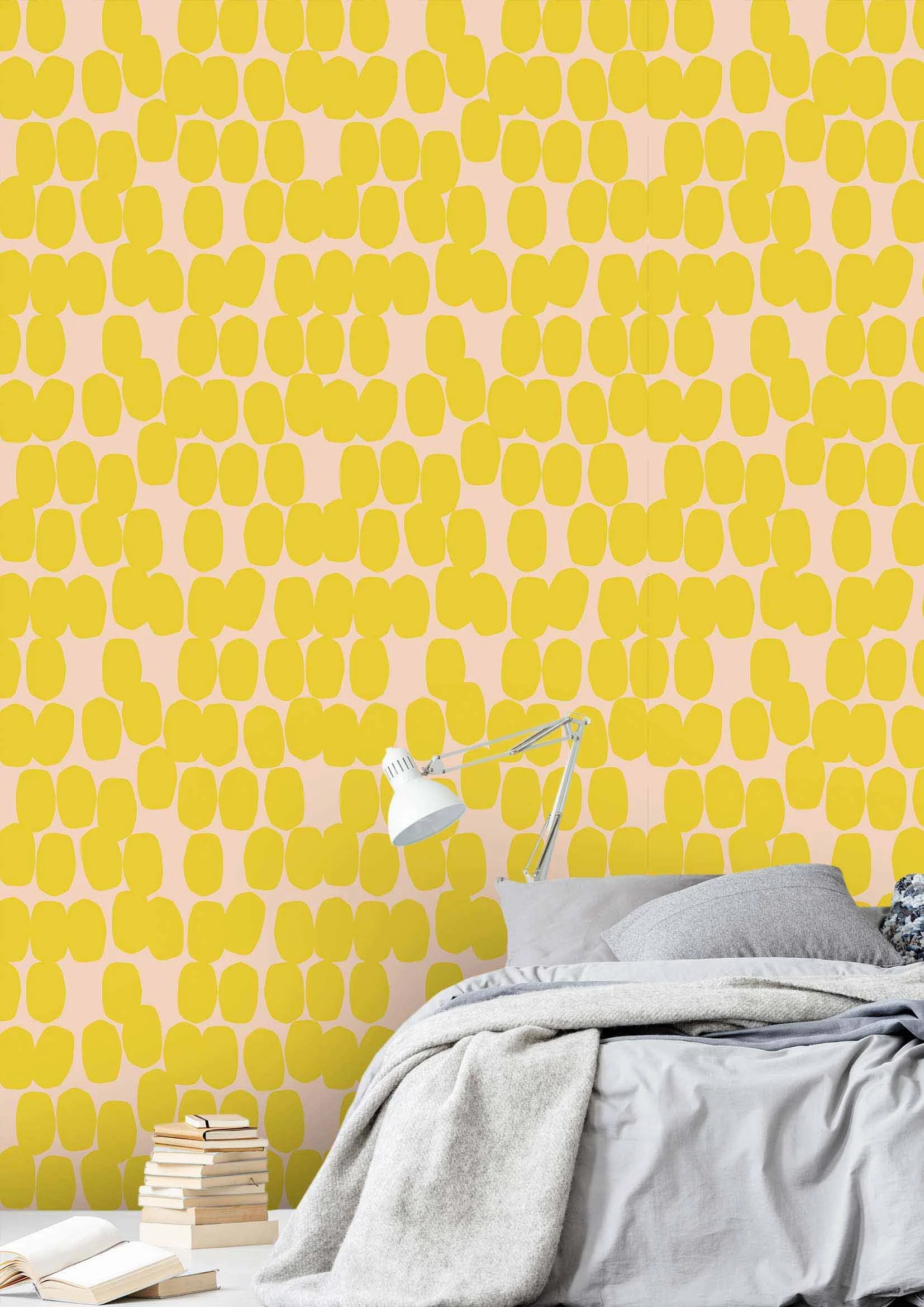
This mini-collection has been an incredibly exciting and fun project for me. It all began with Spoonflower’s Party Wall Design Challenge—a creative competition that asked designers to craft wallpaper that is bold, bright, and bursting with cheerful motifs. The challenge aimed to inspire designs that would be perfect for a playroom or as a backdrop for a fun, lively party.

After playing around with a few different ideas, I finally settled on a theme of bold, simple, and graphic floral images. These designs stood out to me as both festive and playful, perfectly suited for any celebration. At the same time, their versatility makes them an ideal fit for a vibrant playroom, bringing life and energy to any space.

Here is a mock-up showing these modern, colorful floral motifs as wall paper. I think it would make for a spectacularly fun room.

The Creative Process and pushing boundaries with new designs:

Participating in Spoonflower’s design challenges has been a tremendous way to push myself creatively. These challenges encourage designers to step out of their comfort zones, try new things, and explore innovative ways of designing. While this particular floral pattern is comfortably within my design wheelhouse, the challenge spurred me to experiment with a slightly different colorway—a departure from my usual palette.

This new colorway gave the pattern a fresh, modern twist, enhancing its appeal as both a playroom wallpaper and a party backdrop. The process of creating this design also inspired me to develop two more coordinating patterns, expanding the original idea into a cohesive mini-collection.

Here are the two cute coordinating patterns I developed to accompany the main floral medley design.

The importance of creative challenges:

I’m super grateful that I participated in the Spoonflower challenge. If it weren’t for this opportunity, these designs probably would not exist today. It’s so important for creatives to continually push themselves, try new challenges, and work within different limitations. These experiences not only help us grow as artists but also lead to the creation of new and exciting designs.

More importantly, it’s essential to keep making, creating, and simply doing. Each new challenge presents an opportunity to refine our craft and introduce fresh, innovative products to the world. I highly recommend seeking out and trying design challenges in your area of creativity. 

Shop the collection: Bold, Bright, and Fun Patterns

If you’re interested, these bright bold patterns and prints are available in my Spoonflower shop. They will definitely add a touch of bold, cheerful energy to your home ,as fabrics, wallpapers, and home decor items in my Spoonflower shop. Whether you’re decorating a playroom, planning a party, or simply looking to brighten up a space, these versatile designs will definitely make a statement.

Explore the collection and bring a little more color and joy into your life with these fun and festive patterns. Visit my Spoonflower shop to discover more!

new POPPY mini collection

I am happy to announce my new POPPY MINI COLLECTION. It is a fabric collection of modern, fun and playful florals. This collection celebrates the beautiful organic shapes of the poppy flower in a bold, playful and reductive pattern.

I was inspired to create this collection while biking through my new home town of The Hague one beautiful sunny day last spring/summer. The Springs and Summers here bring a BURST of flowers and colors and delicious floral scents. You can find every imaginable shade of green, pink, purple and blue. It’s truly a beautiful, wild sweet-smelling sight. One of the many flowers that bloom along these bike paths are the fragile, yet bold poppy flowers. Their bright delicate petals and dark commanding centers called out to me. I had to stop my bike, pull over and snap some reference photos so I could go home and sketch some designs.

I prefer to start drawing in my sketchbook vs. my iPad. When I go straight to the iPad, I tend to erase too much, resulting in my drawings look stiff and less organic. My current preferred tool for sketching is the big chunky Pilot V Sign Pen, although this preference is constantly changing :). The thick pen stroke makes it hard for me to draw tiny details, so it is great in helping me get to the essence or the vibe of the flower. It helps me to be playful and reductive. I like a bold but somewhat clumsy line quality. Once I draw in my sketchbook for a few sessions, then I take a picture and import it into procreate to use as a reference or starting point, but sometimes I'll trace my drawing if I feel I've captured the desired look.

With this poppy design, the organic floral shape came to me pretty easily. However, it took me a while to settle on the right color combinations for both the main floral pattern and its coordinating patterns. When I start to draw and design in one color, it is hard to envision it in a new colorway. So setting parameters helps me tremendously when deciding on colors. I knew I wanted these stylish and modern floral poppy patterns to be eye-catching home decor prints, and with that in mind, I definitely knew I wanted to include Pantone’s color of the year, Peach Fuzz, and Benjamin Moore’s Blue Nova. These color choices would satisfy the market for trendy home furnishings. Besides that, I knew I wanted something with a fresh spring feel and I alway love a vibrant fluorescent.

Below you’ll find my chosen colorways. Let me know what you think of my color choices.

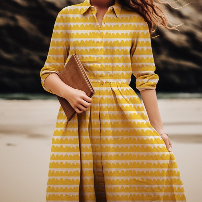
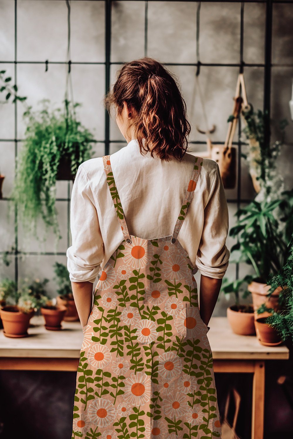
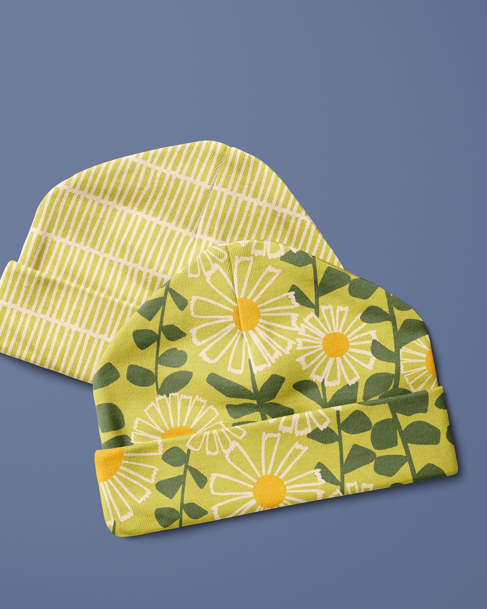
Here are my favorite colorways along with some ideas for utilizing the fabrics. I’d love a big, bold, vibrant, poppy flower dress! Or what about a modern graphic gardening apron for digging in the dirt?. The versatility of the colorways also allows for a sweet and stylish baby’s knotted hat.

To sum up, when creating this collection, I tried to keep my target audience in mind - modern, design-conscious individuals who appreciate bold and unique patterns. I structured the collection to include a variety of colorways that would appeal to different tastes, while hopefully maintaining a cohesive and playful look. The result is a collection that is both versatile and distinctive, perfect for adding a pop of color and personality, to any space or project. Whether used as statement pieces as home decor items or mixed and matched with other prints to make for a vibrant and playful quilting project, these fabrics will add a touch of cheer and whimsy to any space.

This Poppy Mini collection is now available to purchase in my Spoonflower shop. Explore the collection and find the perfect print for your next creative project, and if you are up for it, I’d love to see what create! Please share with me on Instagram, email me or tag me in your posts. Really, I‘d love to see what you crafty creatives come up with!

Thanks y’all!

new Daises Collection

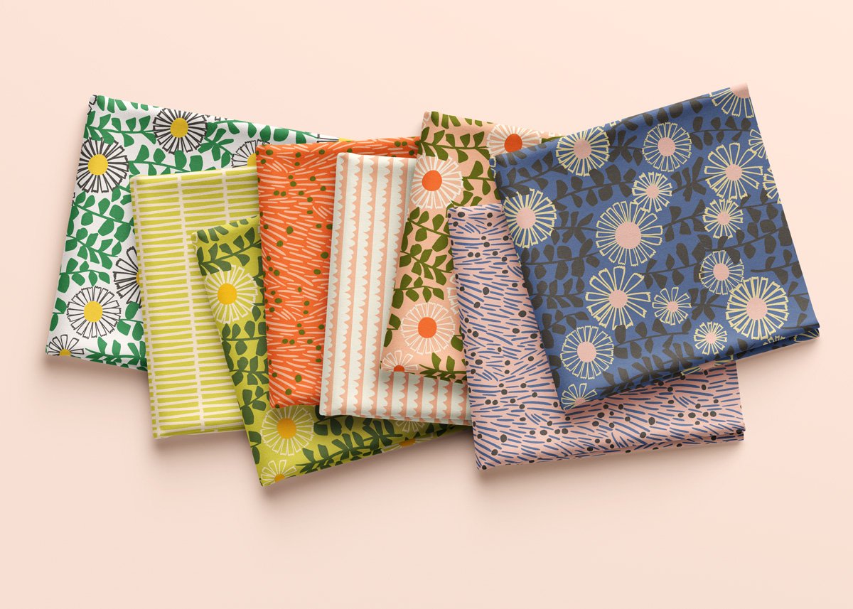
I am very excited to share with you some of my new pattern design work. This is my new DAISIES collection. This past fall, I started to design with more of a collection mindset which means creating a “hero” design and a few supporting patterns to accompany the hero pattern. Initially it was challenging but now I am finding it thoroughly enjoyable. I still have lots to learn and figure out but I believe I’m getting the hang of it, and now I love creating the coordinating patterns.

Once the design is figured out, the next challenge for me was to create different color combinations. It is a fun challenge, but when you start creating the collection in a single color way, sometimes it is hard to transform it into completely different colors. I am sure there are a lot of designers who do this process systematically but I tend to lean on my instincts, at least for now.

This was the original color combination that I designed the entire collection in.

One thing that really helped me with creating the new color combinations was to put the designs in these clean and beautiful mock-ups. These mock-ups bring the collection to life and really allow me to see them as more than just flat vector files on my computer.

I think this peachy combination is my favorite of the bunch.


I was inspired to work with the Pantone Color of the Year with this design. Peach Fuzz is the color for 2024, so I wanted to create a color combination showcasing this scrumptious peachy color. This turned to be my favourite color way of the collection. That was a surprise to me.

A moody take on spring daisies with Benjamin Moore’s color of the year, Blue Nova.

I also decided to create a design using Benjamin Moore’s color of the year, Blue Nova. I thought it was a good idea to create fabrics that could match and coordinate with currently trending interior paint colors. It was also super helpful to have some limitations when considering color. Without a specific color goal in mind, I found myself working myself into circles with all the endless possibilities of the rainbow.

A somewhat vintage or retro vibe to this color combination.

With this final color combination, I tried to channel some vintage and retro vibes. I really love that dark green, specially alongside the citron yellow.

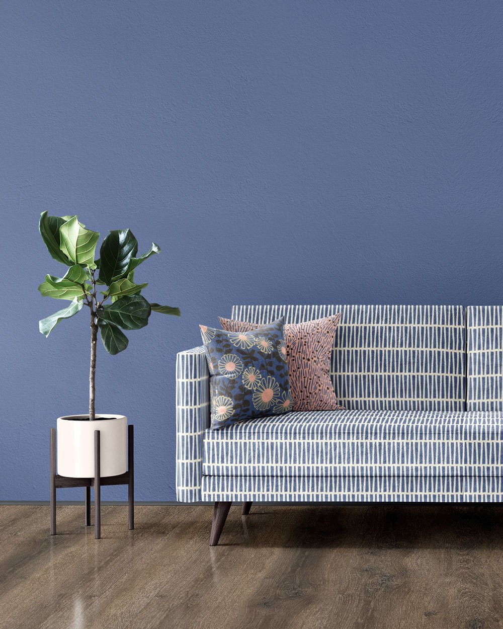
Another great part of working with mock-ups is that it helps me to work on scale relationships between the designs. It is also very helpful to see how the designs work differently on different products. And most of all, it is super fun and satisfying seeing the designs on products. Here are a few product mock-ups that make me happy.

As of today, these designs are available on my SPOONFLOWER shop where you can get not only fabric but also some home decor items like tea towels and napkins and table clothes. Be sure to check it out, and If you don’t end up shopping yourself, please heart your favorites in my shop . It really helps others find me amongst all the amazing designs available. Thanks!

the PANSIES collection

Hi Friends! I wanted to let you know about this new mini fabric collection I created using my Pansy Flower. I created several new and fresh color combinations as well as a coordinating pattern showcasing the linear aspect of the stems and leaves. Head on over to my SPOONFLOWER shop to see all the crazy color combinations I created, and while you are there please heart your favorites as it really helps me to be found by new customers. Thanks so much!

Thanks for reading.

Overcoming Sketchbook Intimidation

Do sketchbooks intimidate you like they intimidate me?

Sketchbooks are beautiful, bound bundles of creative potential.  However, somedays, they can evoke feelings of trepidation rather than inspiration. Do you ever find yourself staring at the pristine pages, afraid to make that first mark? Do you, like me, have ambitious dreams of filling its pages with your true creative self? Then find yourself frozen when faced with the first stroke?

I have a love-hate relationship with sketchbooks. On one hand, I adore them. They represent possibility, growth, and artistic expression. Each new sketchbook feels like a fresh start, a blank canvas waiting to be transformed into a sweet little gem. But on the other hand, they terrify me. What if the first drawing is awful? What if the first drawing sets the tone for the entire book?

Sound familiar?

I can’t count the number of times I’ve bought a new sketchbook with grand intentions, only to let it gather dust on my shelf because I was too afraid to begin. The struggle is real.

But I HAVE to draw. Without it, I find that my mood slips, and grumpiness sets in. So, what do I do about it?

Some days, I muster up the courage to say “screw it” and dive in headfirst. Other days, I let the fear win, and the sketchbook remains untouched. Today was one of those days. I received a stack of sketchbooks for Christmas (seriously, the best gift idea for an artist), and yet, there they sat on my shelf, mocking me with their pristine-full-of-potential- pages.

But. I needed to draw! The urge is so powerful some days.  So, I made a choice. I set aside the new sketchbooks and reached for something familiar: plain old printer paper.

With no fear of ruining a perfect sketchbook, I folded the paper in quarters and began sketching. And you know what? It was so freeing!  There was no pressure, no expectation—just me, my pencil, and a plain old sheet of paper. I was able to draw a handful of fruit bowls that have been lingering around in my head. I even liked a lot of them! 
At some point during drawing, I  decided to document the process with a video. As soon as I pressed the record button, I felt nervous. I was nervous in the same way I am nervous about new sketchbooks. Of course the video captures some of my least favorite drawings from the day. But you know what else it captures? The satisfaction of overcoming fear, and the simple pleasure of putting pencil to paper.

I hope you enjoy this process video and the photos of all the drawings from the day. I do plan on spending more time with these drawings and developing them into something more than meer pencil sketches.

How do you all get started in new sketchbooks? Is it easy for you? How do you approach that first blank page? Please comment with any tips or tricks that you use!


From seemingly insignificant doodles to realised designs-reflecting on creative growth

I have been spending some time on my website, working on improving the SEO, so I have found myself delving deep into my OLD blog posts. It’s a bit embarrassing to look back, but ultimately, it has given me perspective and shown me how far I have come in my creative pursuits. It has also been enjoyable to see the origins of some of my current work.

For instance, in 2014 (wow, 10 years ago!), I was drawing highlighters with highlighters and that lead me to paint a sweet gouache painting of a bunch of highlighters in a grid layout.

My original sketch of highlighters drawn with highlighters.

My gouache painting of highlighters. I left off the type saying highlighter and added VERY IMPORTANT-TAKE A LOOK.

This then led me to recreate the idea digitally in Procreate. I kept the type that reads “VERY IMPORTANT-TAKE A LOOK,” but decided to bring back the streaky effect that actually occurs when you draw with a highlighter marker. I did just make this design available in my Spoonflower shop, so check it out if you are interested. :)

My digital illustration created in Procreate.

While I was tempted to delete the Highlighter Blog Post from 2014 because there is absolutely nothing remarkable about that post at all, I decided to keep it as it is a reminder to me that creativity is a process, a journey, and one random little doodle can often lead to bigger and better designs and ideas. It reminds me that I must continue to make those little doodles that mean nothing at the time because you never know where they will lead you.

I have more examples that I can think of, and once I gather up the images, I will be sure to share because I think it is VERY IMPORTANT to TAKE A LOOK and reflect on where you are and where you started.

“Gathering in the Garden”: A Collaborative Fabric Collection with Cotton + Steel Fabrics.

Announcing “Gathering in the Garden”: A Collaborative Fabric Collection with Cotton + Steel Fabrics.

Hi friends, I'm super excited to share with you all my first fabric collection with Cotton + Steel Fabrics! The collection is called Gathering in the Garden, and as the name suggests, it features playful floral patterns: tulips, camellias, and poppies, to name a few. The patterns are a mix of vintage charm with a modern touch.

Screen-printed in Japan on high-quality cotton, this collection is perfect for so many things—from quilters to home decor enthusiasts and those who love to get crafty. I hope the collection will bring joy and inspiration to makers around the world.

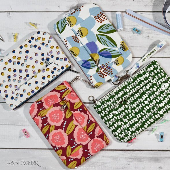
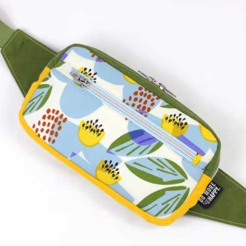
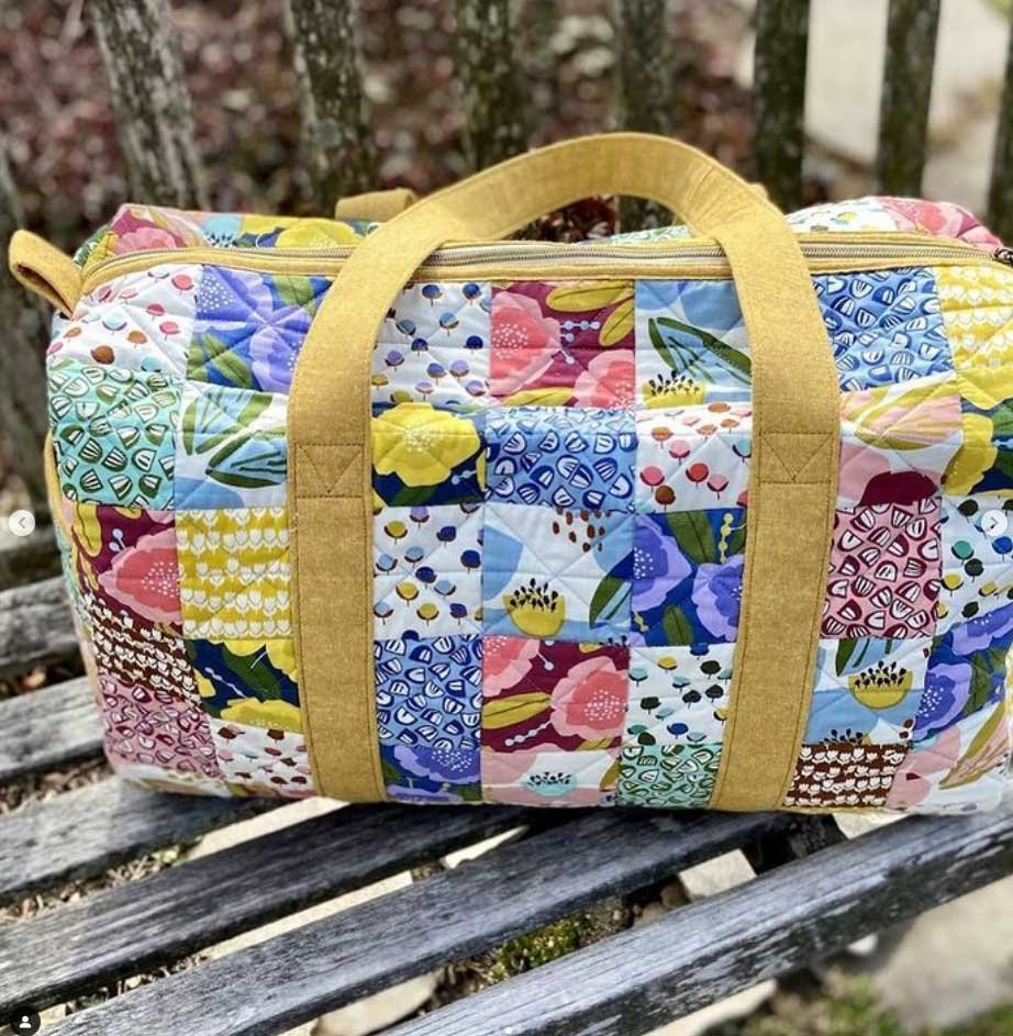
Here are a few examples that people have shared with me so far! Amazing! Seeing these fabrics come to life on these beautiful bags makes me so happy. Look how cute these zippered pouches by kleines_hand_werk are! And Jacqueline at raketenfrau has definitely figured out how to make fanny packs covetable. Crimson Tate’s patchwork duffle kit makes me want to head out for some weekend fun.
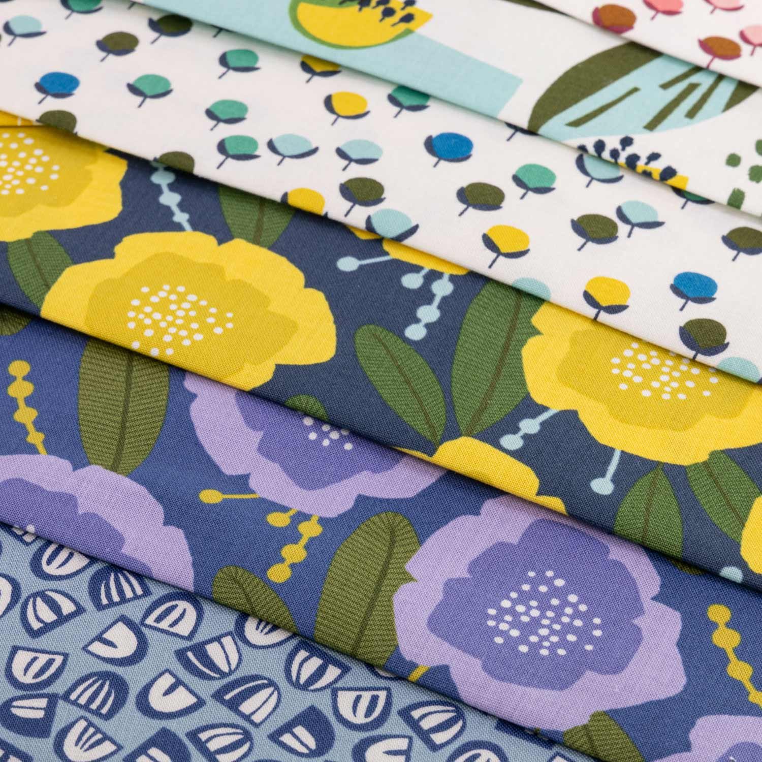
Being my first fabric collection, I wasn't sure what to expect, and I was curious to explore the collaboration process. Cotton + Steel made the process so enjoyable. It was great to combine their knowledge of the industry with my passion for creating. One of my favorite parts of collaborating was discussing possible colorways and scale changes. It pushed me as a creative person, and I am grateful for that.

I am very proud of Gathering in the Garden and hope it brings you as much joy as it has brought me. Happy Sewing!
Don’t know what to draw?

Inspiration can strike from anywhere, even during your daily stroll!
Since I have been drawing daily in my sketchbook, I often find myself wondering what to draw. Lately, I have begun to photograph anything and everything that sparks my interest. Whenever that little voice speaks to me, I pull out my camera and take the photo without overthinking about the why. Then when I am home later in the day, I have a collection of resource photos to draw from. Of course, I don’t draw everything I photograph, but it’s nice always to have something on hand to draw from. Plus, it’s a great way to build a collection of resource photos to draw from that have meaning and a personal connection to you.

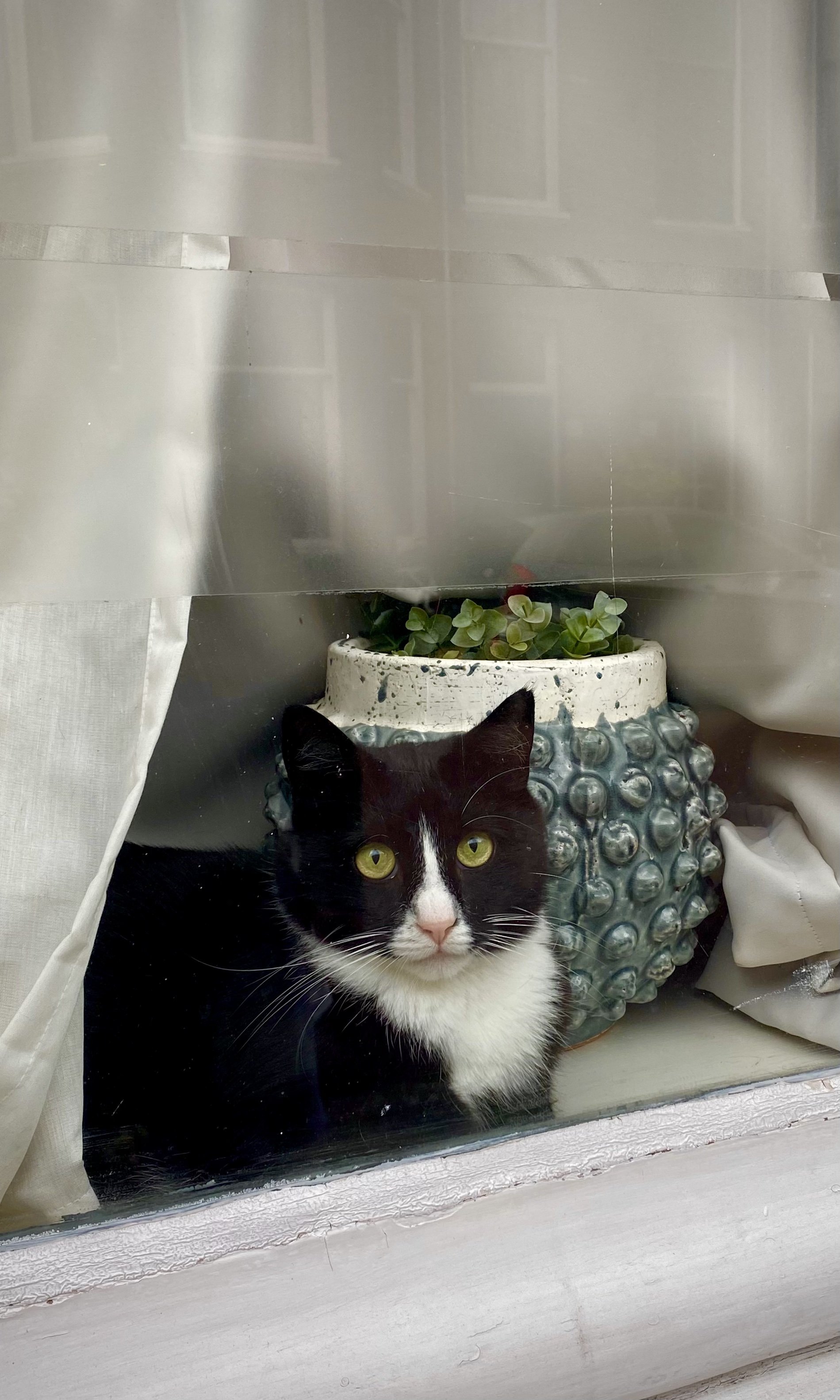
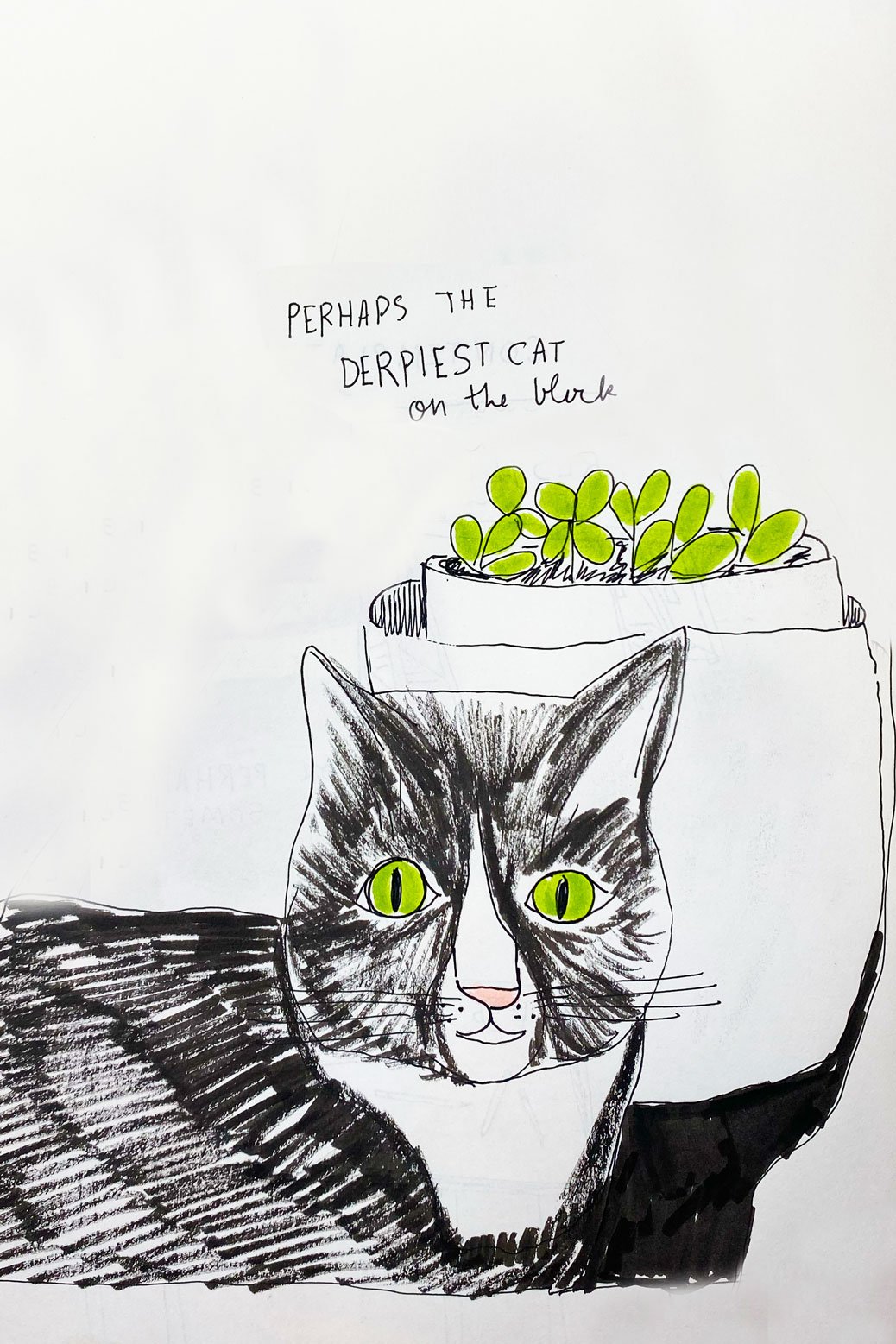
Here is an example of a quick sketchbook drawing of a super cute and derpy cat I saw while on a neighborhood stroll. Inspiration can also strike within the home, so if I see something that sparks my interest but don’t have the time to draw at that moment, I’ll photograph it for later.

WALLPAPER!

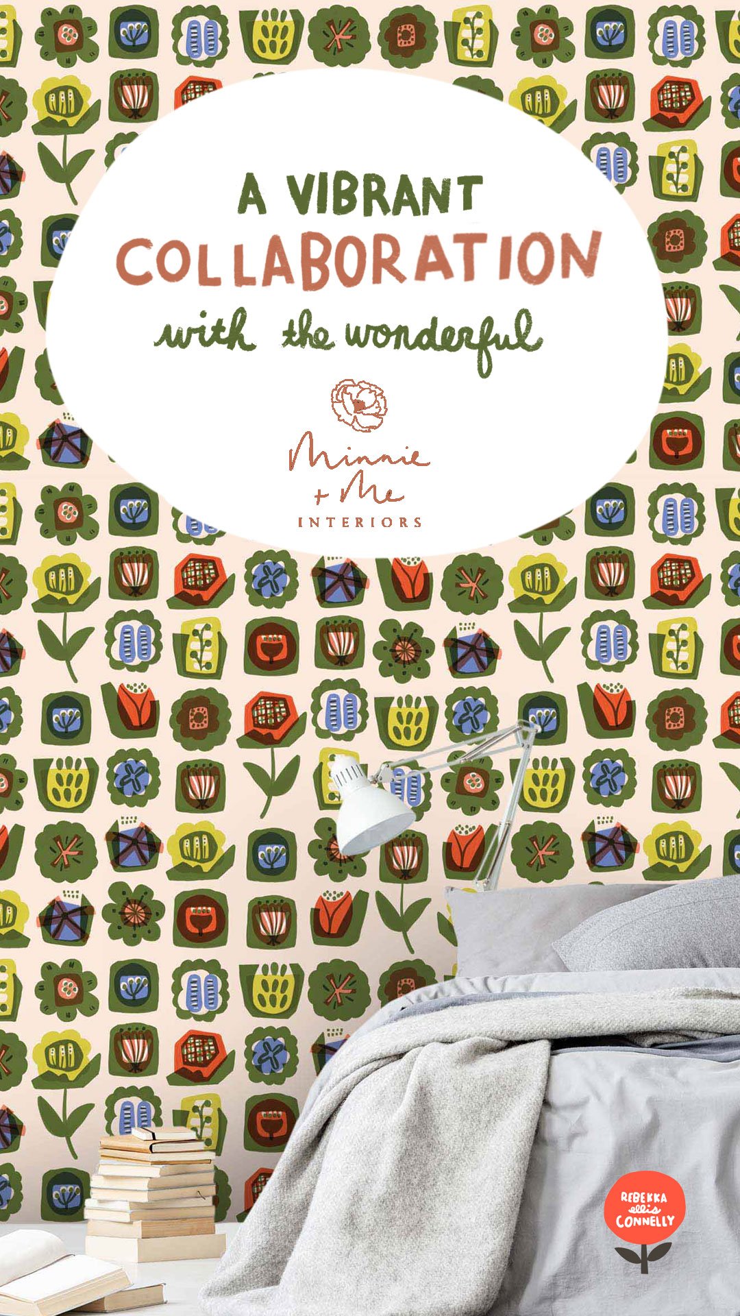
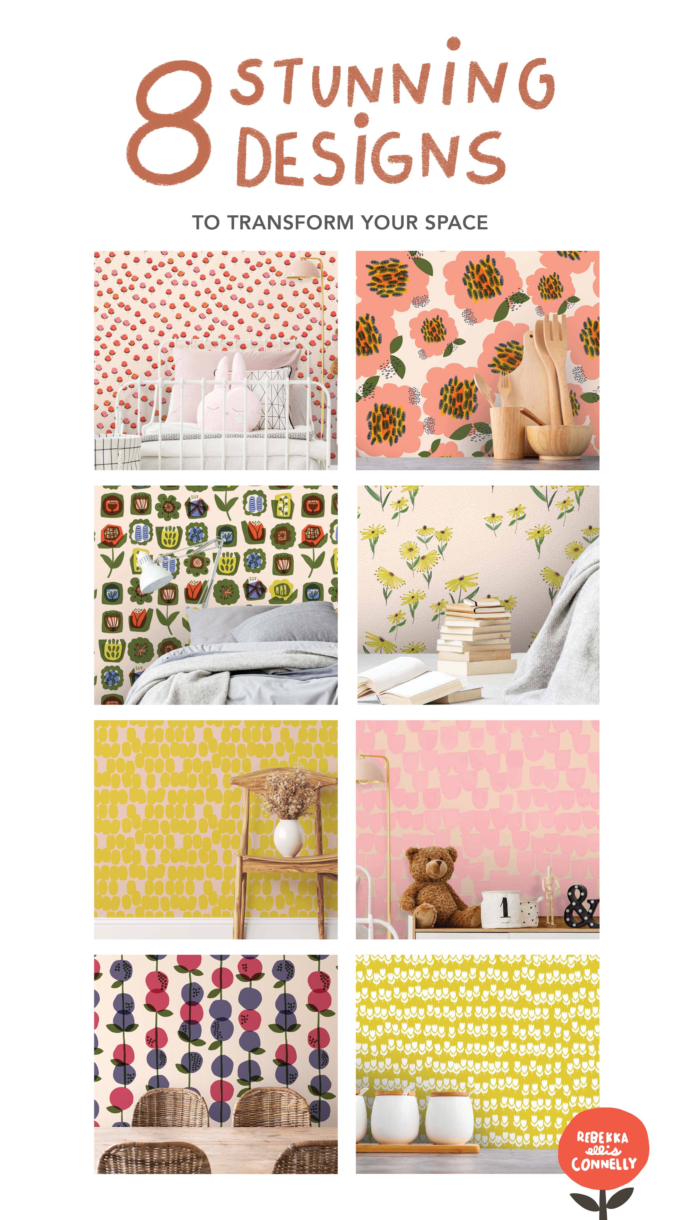
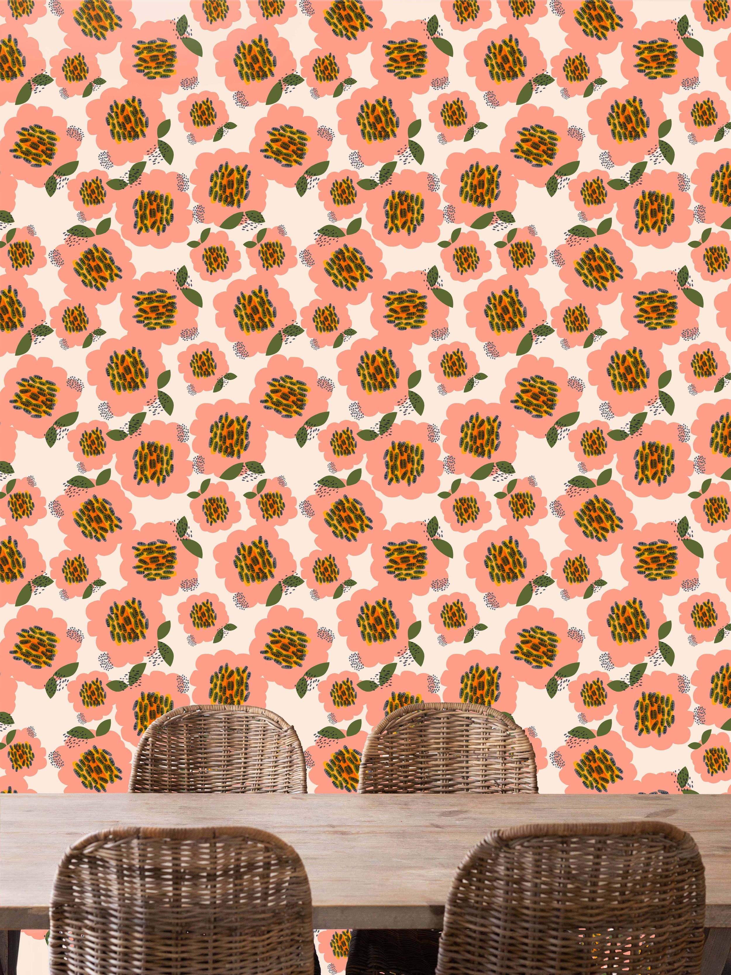
I am so excited to announce my collaboration with the wonderful Minnie and Me Interiors to bring you a vibrant collection of WALLPAPERS. You can choose from 8 different designs- from big bold pink flowers, that would brighten any dining room to soft abstract organic shapes for your more quiet spaces. I tried to combine a bit of the modern aesthetic with the timelessness of midcentury design. I think the color combinations are playful yet also sophisticated. I hope the designs inspire creativity and help bring some playfulness into your home.

Besides the designs being versatile, the wallpaper itself is incredibly practical. They are not only removable, but also reusable! So, if you are like me, and feel the need to rearrange your home on a regular basis, or have a hard time committing, you can feel confident and have freedom to explore different looks

Here are a few of my favorites, but please check out the entire collection at Minnie and Me.

Wallpaper with White tulips on a citron yellow background with a set of wooden kitchen utensils

Update 2023

Hello there! it has been A WHILE! Things have been busy around these parts. My family and I moved continents earlier this year. We traded in the warm tropical weather of Singapore for the windy maritime weather of The Netherlands. We are all adjusting, although summers here are proving to be amazing! I hadn’t realized how much I had missed seasons while living in Singapore. It’s always summer in Singapore. Oftentimes, people describe Singapore weather as hot, hotter, and hottest. Anyways, enough about the weather!

Settling into a new country takes some time. So much to learn all at once learning a new language, grocery shopping in a foreign country, and bicycle riding rules and etiquette. The Dutch language is proving to be challenging to learn, but I am enjoying the process and reminding myself that it will take time. I am learning to just go for it, to speak out loud, and learn from my many many mistakes. One thing I have learned from living overseas these last 5 years is how much it challenges me and helps me to grow and learn. Here’s to personal growth!

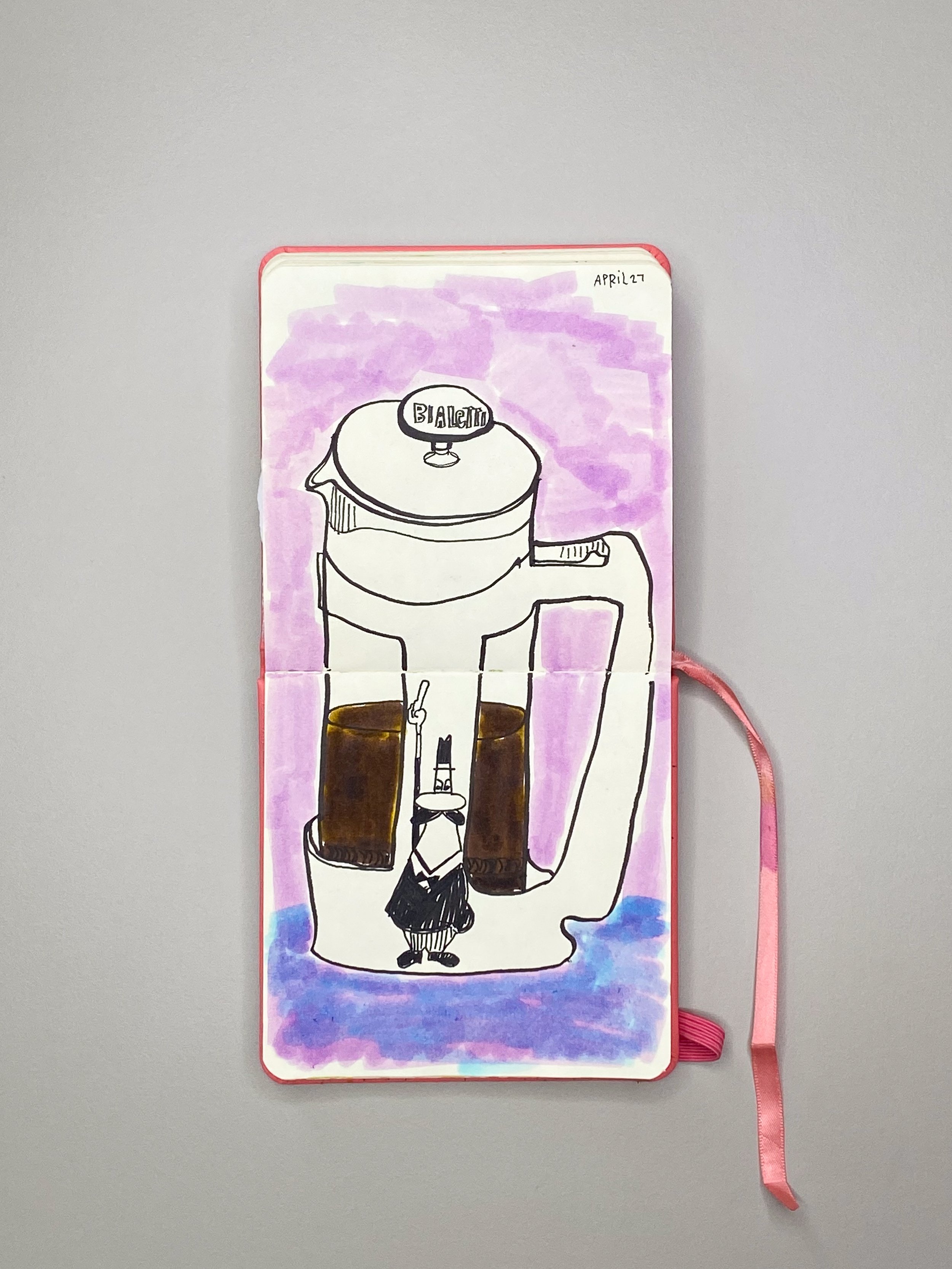
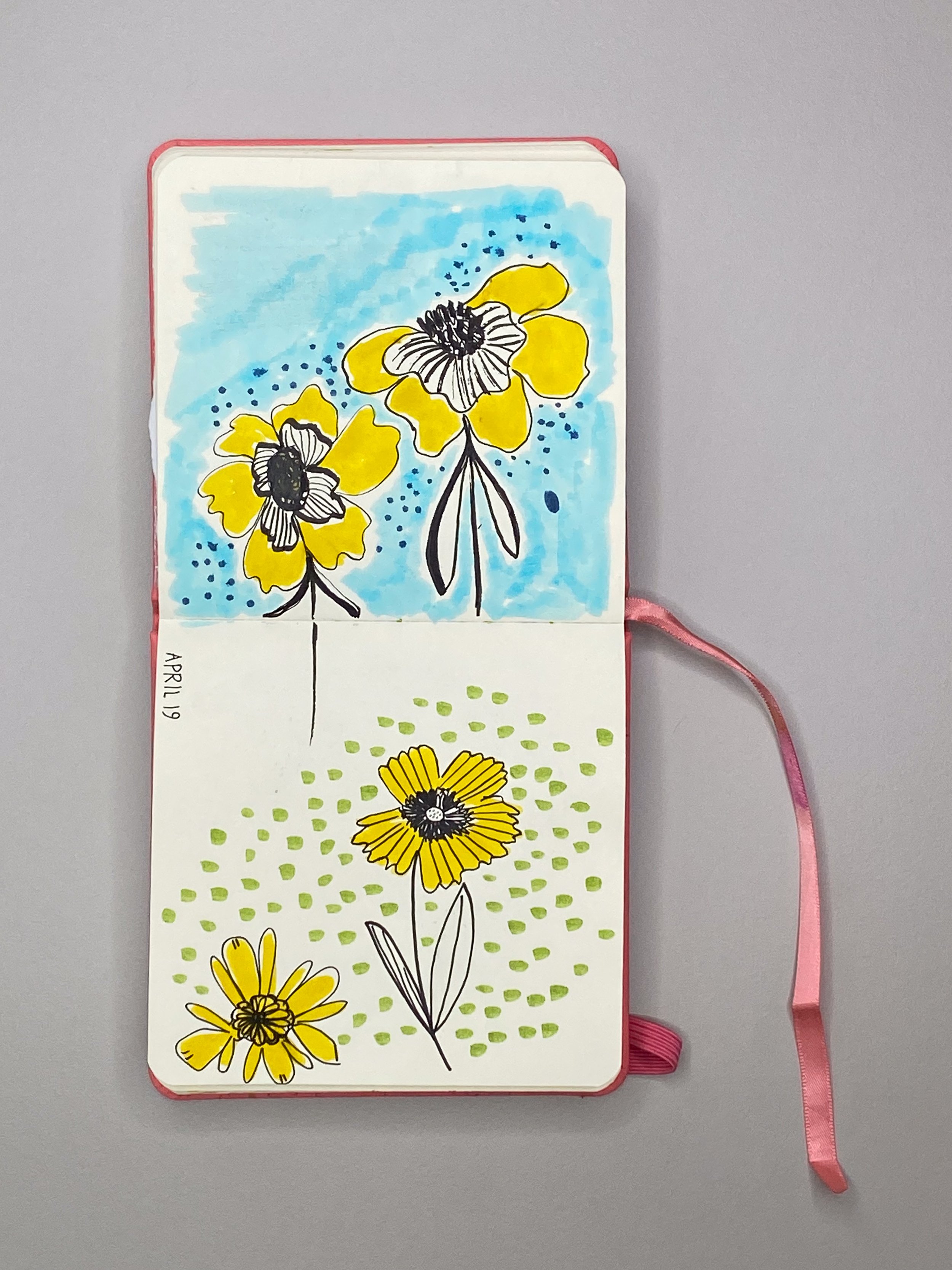
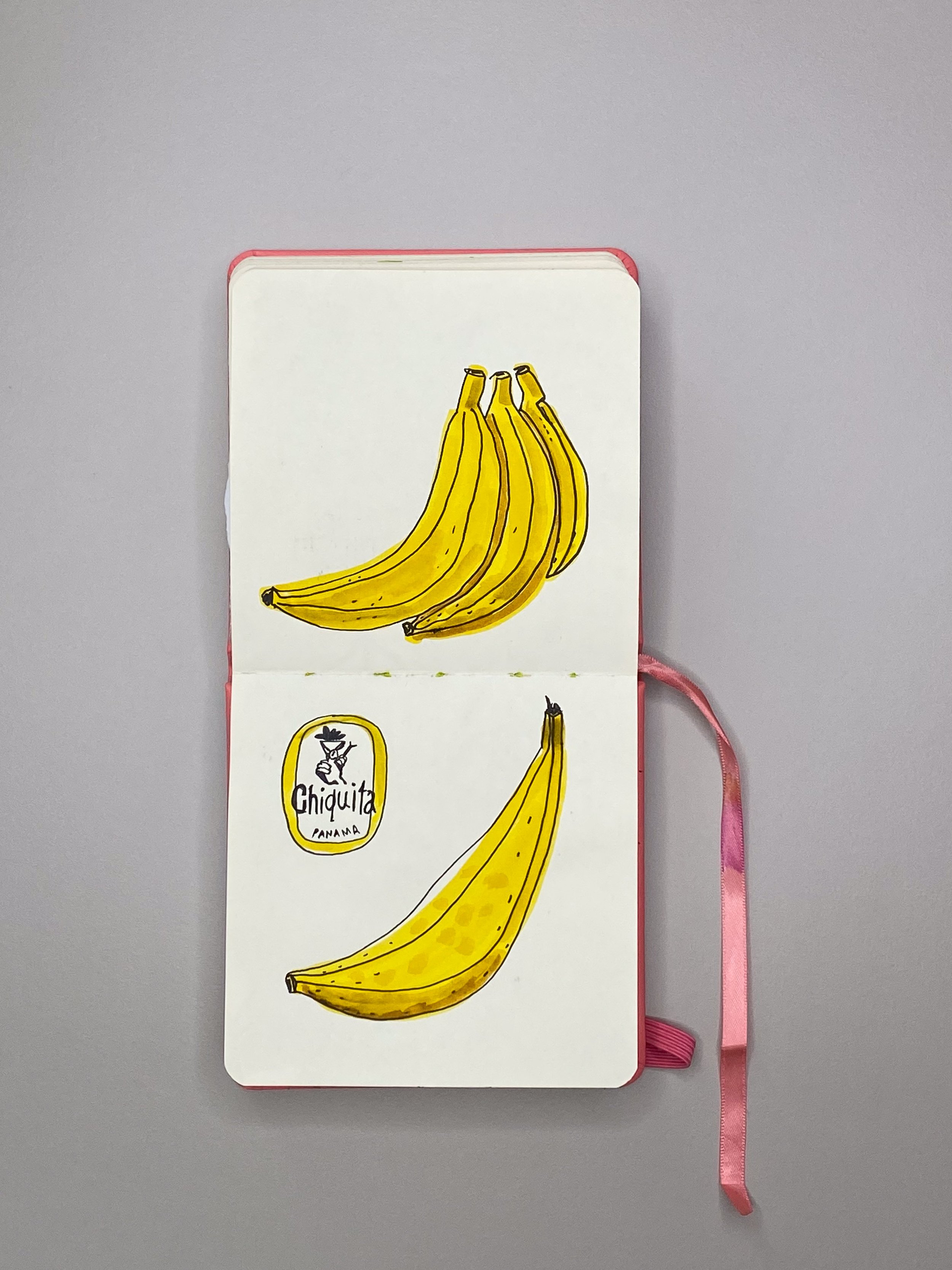
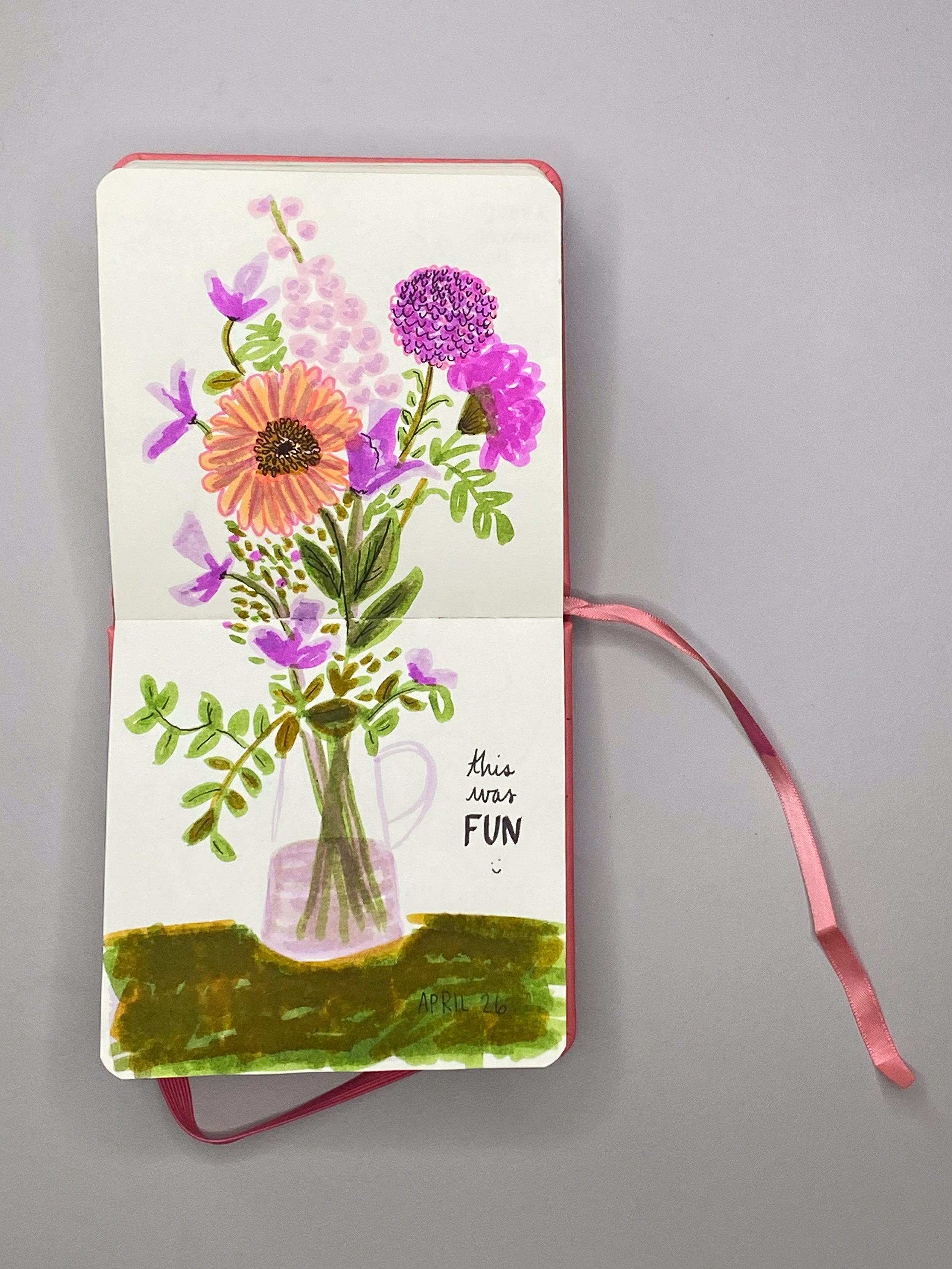
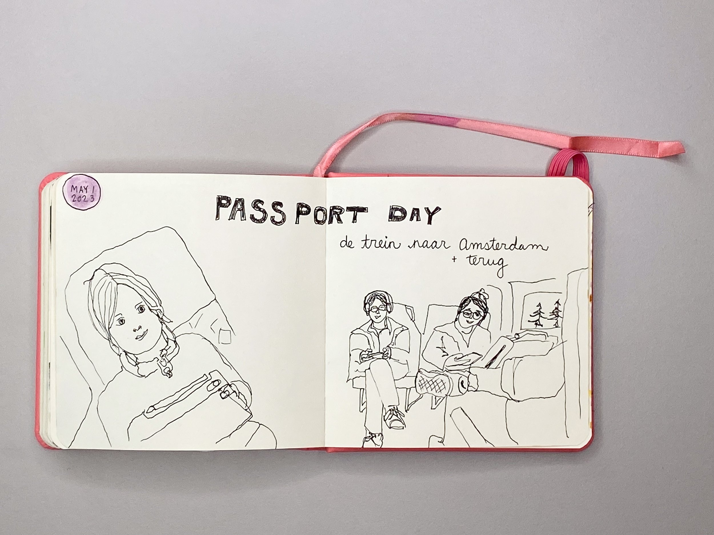
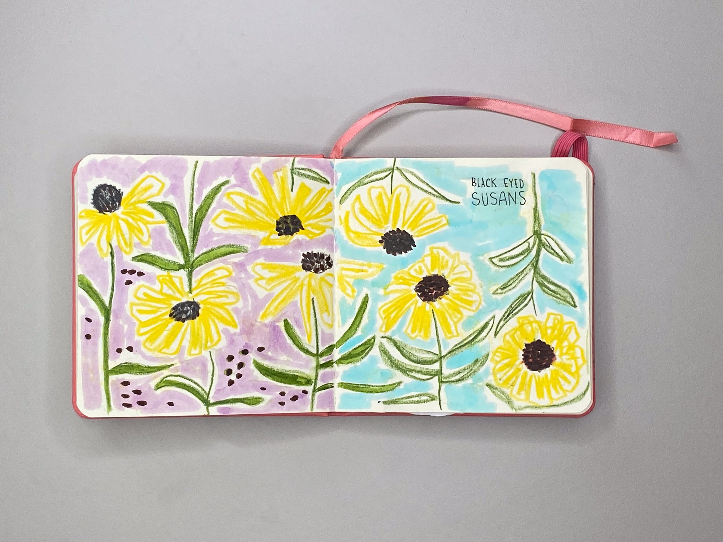
While we have been settling in, I have been continuing my creative practice. Inspired by a new environment, new climate, and new customs, has led me to rediscover my sketchbook. For the last few years, I have been creating mostly with Procreate (which I love!), but since the move, I have reconnected with real pens and pencils on real paper and I find the whole process extremely satisfying. I have also adjusted my mindset while sketching. I no longer berate myself for terrible drawings, instead, I laugh at myself and wonder how I could do better, and then I try and do better! I also no longer let myself be afraid to draw something. If it scares me (I’m talking to you people and faces), I must draw it. I desperately want to get better at my craft and I can’t improve if I am avoiding what scares me. I am just enjoying the process and feeling happy to be making.

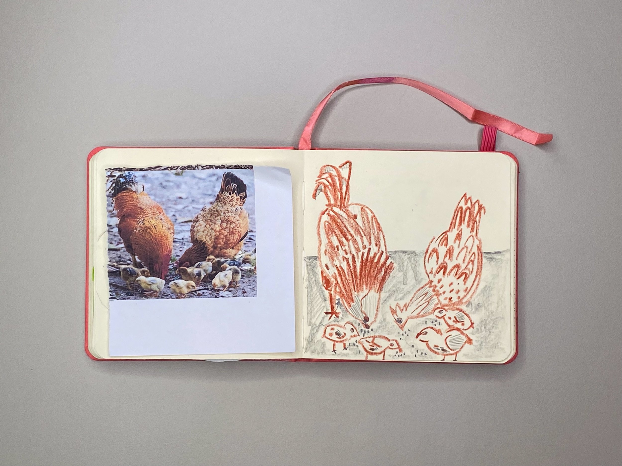
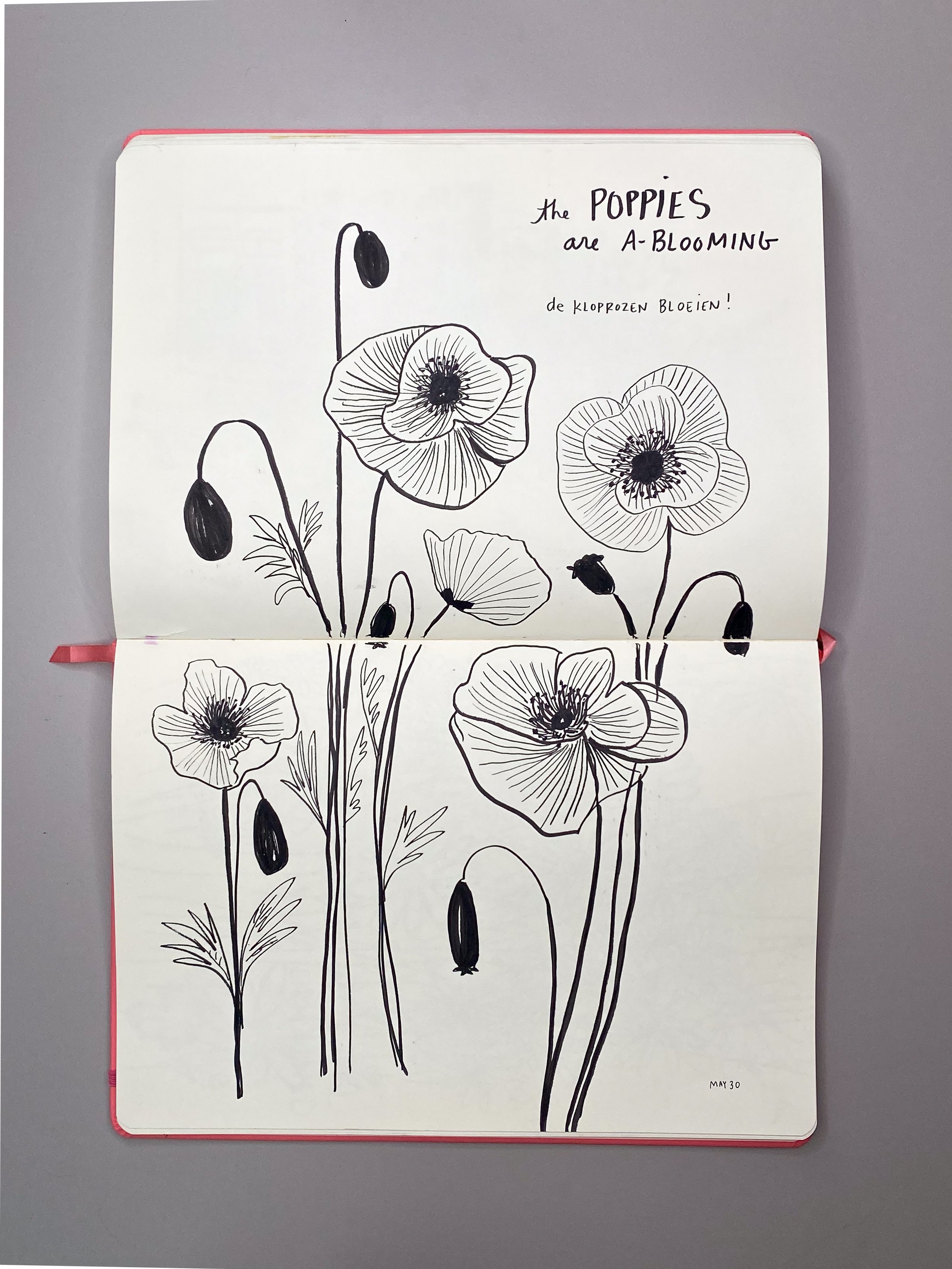
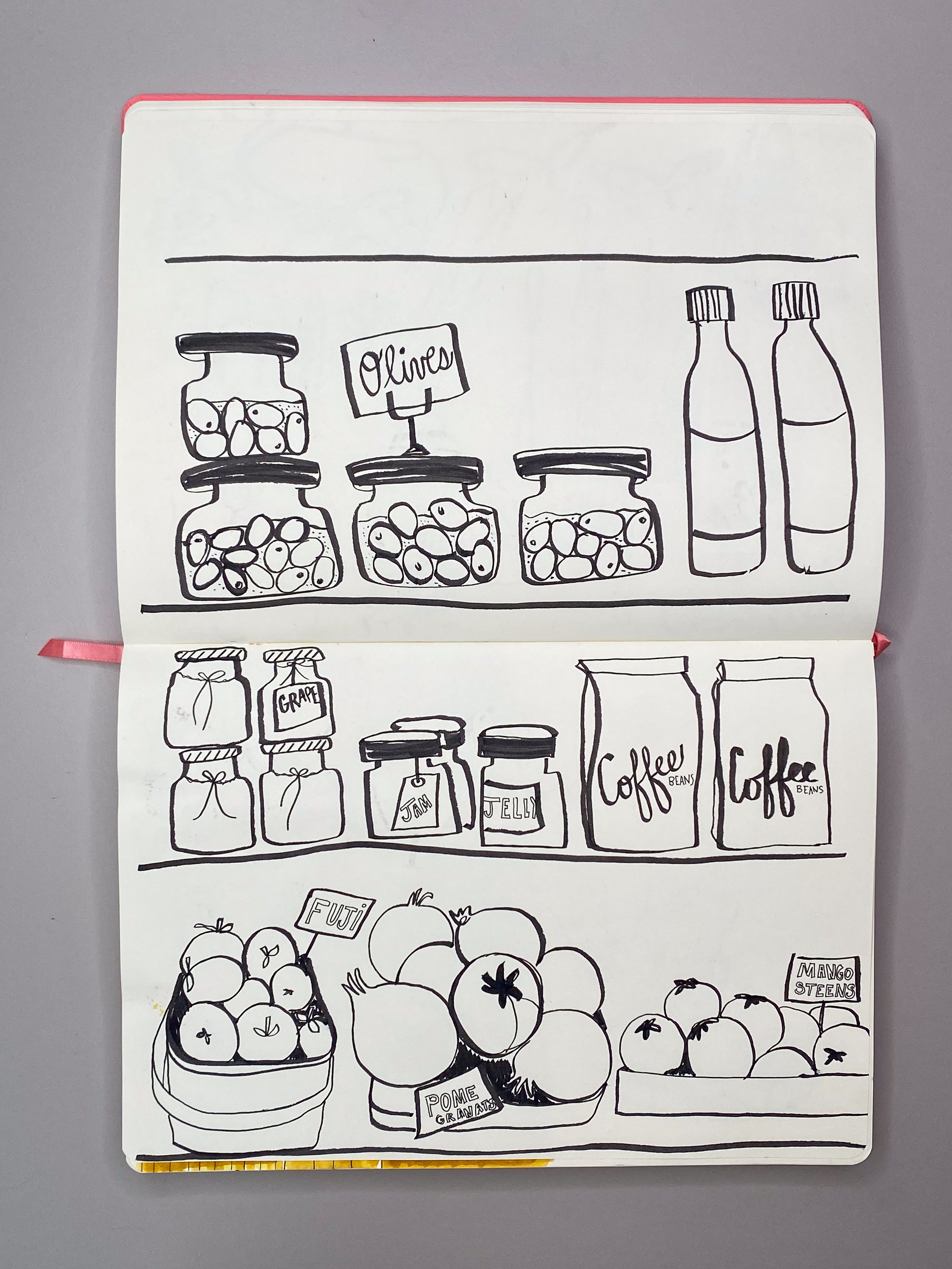
Thanks for reading this far! Below are some photos from my first couple of sketchbooks while living in The Netherlands. At first, I chose a small sketchbook as it felt less intimidating and precious, but as I drew more and more I took the plunge and got a larger one.

Take a look. Hope you enjoy.

TEXTILES NOW AVAILABLE

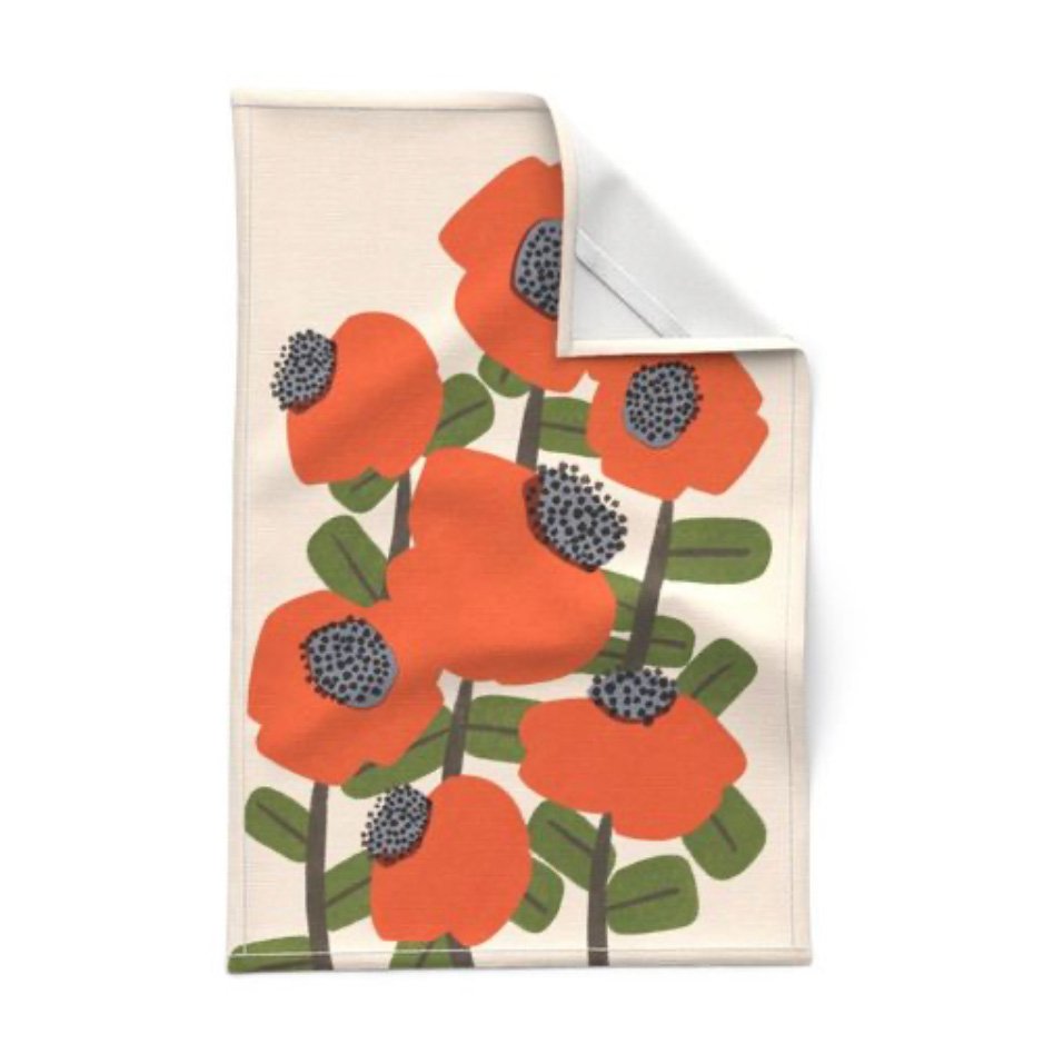
Super excited to announce that I am now selling select designs through SpoonFlower. This means you can order my playful floral fabrics by the yard.. You can also look for home decor items like tea towels, sheets, napkins, curtains, just to name a few! It’s all so very exciting to me. Here are a few examples of the SpoonFlower offerings. Fill your home with these happy floral prints. Please, when you have a moment, take a look and let me know what you think!

These are just a few of my favourite offerings available on SpoonFlower. There is much much more, so please take a look. :)

WEBSITE UPDATE

I finally updated my website to include my recent collage works and photographs of Singapore. It has been a long while since I have updated it and ideally I will now continue to keep it up to date. One can hope. :)

ALSO . . . I now have a SHOP

Currently, some of my collages are for sale. Check them out if you’re interested.
Free international shipping!

Here is what the new homepage looks like.

Here is what the new homepage looks like.

CATS

When the motivation to draw cats hits . . .

These cats were drawn in Posca Markers on paper.

These cats were drawn in Posca Markers on paper.

Then, I was motivated to paint a large cat on Arches Paper in acrylic paint. Below you can see my painting alongside my cat for scale.

Then, I was motivated to paint a large cat on Arches Paper in acrylic paint. Below you can see my painting alongside my cat for scale.

This is my cat, Suki, pondering life as a cat.

This is my cat, Suki, pondering life as a cat.

And this is an example of how I like to imagine cats on dinner plates.

And this is an example of how I like to imagine cats on dinner plates.

While this is how I image seeing them on tote bags.

While this is how I image seeing them on tote bags.

UPPERCASE MAGAZINE

So happy to share that my surface pattern design work has been included in the UPPERCASE Magazine's Surface Pattern Design Guide.  Pretty cool, right? I think so. UPPERCASE magazine is a super cool magazine for creatives and crafters and designers. It features all aspects of creativity from surface pattern design to typography and illustration. So, yeah, I think it is pretty cool to be a part of issue 32. Thanks UPPERCASE!